Your visual brand identity is the first impression potential clients receive. If your logo, typography, or color scheme feels dated or inconsistent, visitors assume your service quality matches. Refreshing your brand assets ensures your business looks as established and capable as it truly is.
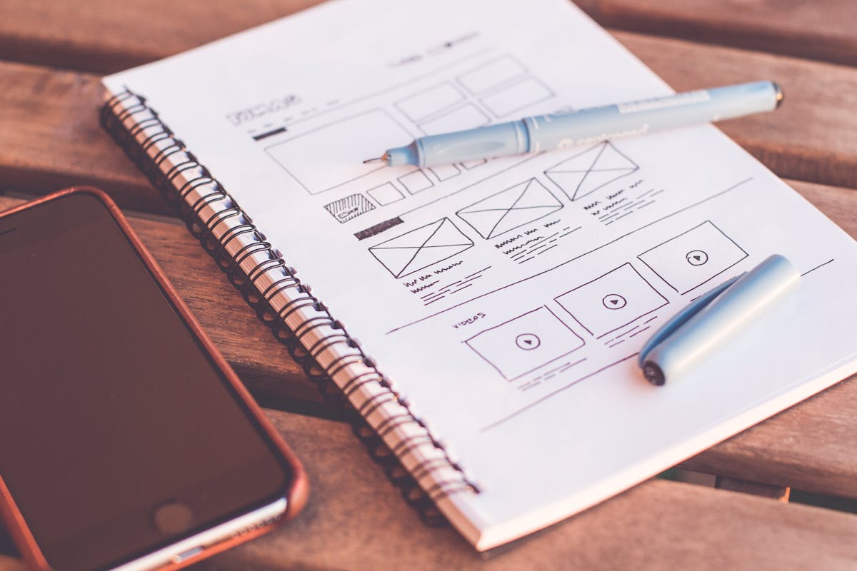
1. Your logo & palette look outdated
A logo designed ten years ago often shows its age on modern retina displays and mobile screens. If your mark uses clipart-style gradients or low-resolution files, a clean vector refresh restores instant credibility.
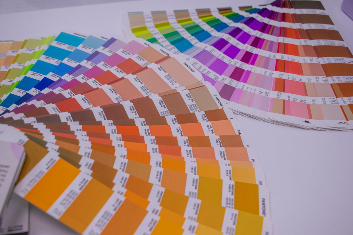
2. Inconsistency across digital channels
If your website, business cards, social media profiles, and email signatures use different fonts or mismatched color shades, your brand loses recognizability. Customers subconsciously question your professionalism when your Instagram bio uses one shade of blue while your website uses another. A documented style guide keeps every touchpoint instantly recognizable as your brand.

-
Unified Brand System:
A brand refresh delivers a defined primary & secondary color palette, font system, icon library, and usage guidelines so every channel looks consistent.
3. Struggling to differentiate from competitors
When every business in your niche uses generic stock vectors or blue color schemes, a unique visual mark makes your studio stand out immediately. Prospective clients scrolling through search results or social feeds will scroll right past a design that looks identical to five other competitors. A distinctive color palette, custom iconography, or an unconventional logo mark gives people a reason to remember you first.

Need a custom brand identity system?
We design logos, typography systems, color palettes, and visual brand guidelines built to elevate your business across every channel.
4. Your business offering has evolved
If you launched as a solo freelancer but now lead an established team offering premium enterprise services, your branding should reflect that maturity. A logo that once represented a one-person side hustle can quietly undercut your credibility when you're now quoting five-figure retainers. Updating your visual identity signals to the market that your capabilities, team, and pricing have all grown up.

5. High bounce rates & low engagement
When visitors arrive at your site and immediately click away, outdated typography or visually jarring colors are often to blame. Clean design creates instant comfort and trust.

6. Targeting higher-tier premium clients
If you are increasing prices or pitching enterprise accounts, your visual presence must communicate premium quality. A sophisticated brand mark justifies higher pricing tiers.

7. Visuals look distorted on mobile displays
Old raster logos look blurry on high-density iPhone and Android displays. Modern brand systems include crisp vector SVGs optimized for dark mode and mobile app icons.
8. Planning a new website launch
Refreshing your visual identity before starting web design guarantees that your new site's layout, buttons, and graphics are built around cohesive brand rules. Trying to retrofit a brand refresh onto an already-built website usually means redoing navigation colors, button styles, and imagery from scratch. Sequencing the brand work first saves both time and budget once development begins.
9. Frequently asked questions
A full rebrand changes your business name, core positioning, and values. A brand refresh modernizes your visual identity (logo, typography, palette, and style guide) while maintaining your established name and reputation.
Yes! Designing the visual identity first ensures your color palette, typography system, and logo mark carry seamlessly through every page of your new website.

Written by Build My Website
We build 100% custom websites, branding, and search engine strategies for small businesses. Operating since 2014 with 142+ websites shipped.