When visitors land on your website, they make a split-second decision on whether to stay or leave. Overcrowded navigation bars with dozens of dropdown links create immediate cognitive friction, causing potential clients to bounce before finding what they need.
1. Cognitive Load and Choice Paralysis
Hick's Law states that the time it takes to make a decision increases with the number and complexity of choices. When a navigation menu presents 15 multi-level links, users feel overwhelmed. Limiting primary links to 4–5 core destinations (Index, Services, Case Studies, Insights, Contact) makes the next click effortless.

2. Mobile-First Navigation Architecture
More than 60% of website traffic comes from mobile smartphones. Complex desktop hover dropdowns break down on touchscreens, leading to misclicks and broken navigation.

-
Clean Slide-Out Drawers:
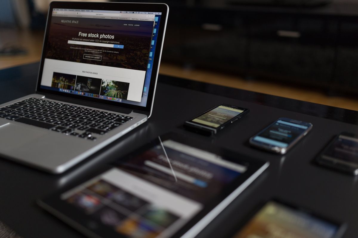
A simple hamburger toggle opening a clean vertical drawer with large tap targets delivers a smooth user experience across all smartphone screen sizes.
3. How Minimal Menus Boost Conversions
Every link in your main menu acts as an exit ramp away from your primary call to action. By keeping menu links direct and pairing them with a prominent "Get a free quote" CTA button, you guide visitors straight toward converting into leads.

Need a High-Converting, Intuitive Site?
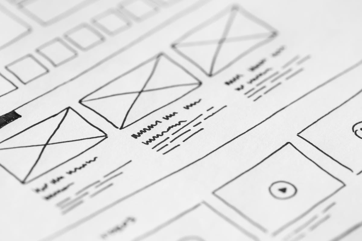
We map user flows, wireframe minimal navigation, and build clean custom websites that guide visitors toward becoming paying leads.
5. Strategic In-Page Linking vs Deep Dropdowns
Instead of stuffing sub-pages into nested dropdowns, organize content hierarchically using structured service landing pages (like our Services Overview page) with pill-navigation jump links. This keeps the main navigation bar short while still giving visitors a fast path to detailed information once they're already engaged on a relevant page. It also reinforces topical relevance for search engines, since related content stays grouped under a single well-linked URL.

4. Clear Descriptive Labels Over Industry Jargon
Avoid ambiguous button text like "Solutions" or "Offerings". Use explicit, familiar keywords like "Services", "Case Studies", and "Contact" so visitors instantly recognize what page lies ahead.
6. Sticky Headers vs Auto-Hiding Triggers
Smart auto-hiding headers slide out of view while scrolling down to maximize content screen area, but reappear instantly when scrolling up so users never have to scroll all the way back to the top to navigate. Persistently sticky headers, meanwhile, can eat up valuable vertical space on smaller phone screens and feel intrusive during long scrolls through content-heavy pages. Testing both approaches with real users on your specific layout is the only reliable way to know which pattern serves your visitors best.

7. Utilizing the Footer as a Navigation Net
When visitors reach the bottom of a long landing page, your footer acts as a secondary safety net. Repeating your primary links and contact information prevents dead-ends.
8. Testing Navigation via Click Analytics & Heatmaps
Use tools like Microsoft Clarity or Hotjar to track user click paths. If analytics show visitors repeatedly failing to find a core service page, simplify your menu hierarchy immediately.

9. Frequently Asked Questions
For small business websites, keeping primary navigation between 4 to 6 items (e.g. Index, Services, Case Studies, Insights, Contact) ensures maximum clarity on both desktop and mobile devices.
Yes, mega menus often create cluttered touch targets and awkward scrolling on mobile screens. A streamlined drawer panel with direct links offers a far smoother mobile experience.

Written by Build My Website
We build 100% custom websites, branding, and search engine strategies for small businesses. Operating since 2014 with 142+ websites shipped.